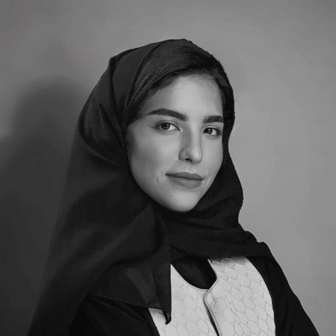
Noha Raheem Reimagines Arabic Calligraphy Through Japanese Kanji
Explore Noha Raheem’s fusion of Arabic calligraphy and Japanese Kanji, where Saudi heritage meets emotion, structure, and global beauty.

Explore Noha Raheem’s fusion of Arabic calligraphy and Japanese Kanji, where Saudi heritage meets emotion, structure, and global beauty.
“Emotions speak to me. They give me motivation.”
In Noha Raheem’s work, Arabic letters do not simply sit on a page. They become structures, symbols, and quiet visual meditations shaped by the elegance of Arabic calligraphy and the vertical rhythm of Japanese Kanji.
A Saudi artist, designer, and calligrapher, Raheem has built a distinctive practice around fusion. Her art brings together Square Kufic, freestyle Arabic calligraphy, Japanese-inspired composition, and a deep emotional connection to language. The result is a visual world where heritage feels alive, flexible, and ready to travel across cultures without losing its soul.
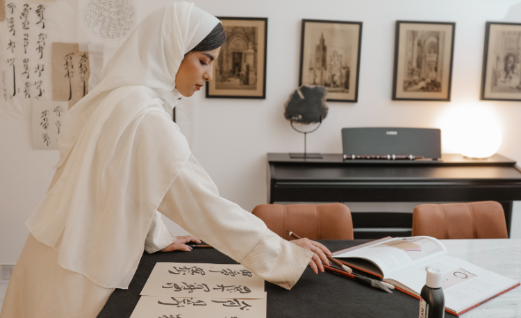
Noha's journey began in childhood, when she found herself drawn to the intricate structure and architectural elegance of Square Kufic script. That early fascination later deepened during her first year studying interior design, where she saw a natural connection between built spaces and letterforms.
“I admired Arabic calligraphy, especially Square Kufic. I started exploring it in my first year of studying interior design because both are architectural.”
That phrase captures the foundation of her practice. For Noha Raheem, calligraphy is not only writing. It is structure, proportion, rhythm, and space. Today, that architectural sensibility extends into her professional work as an Assistant Manager at Diriyah Company, where she has contributed to interior design projects rooted in Najdi identity, cultural authenticity, and visual storytelling.
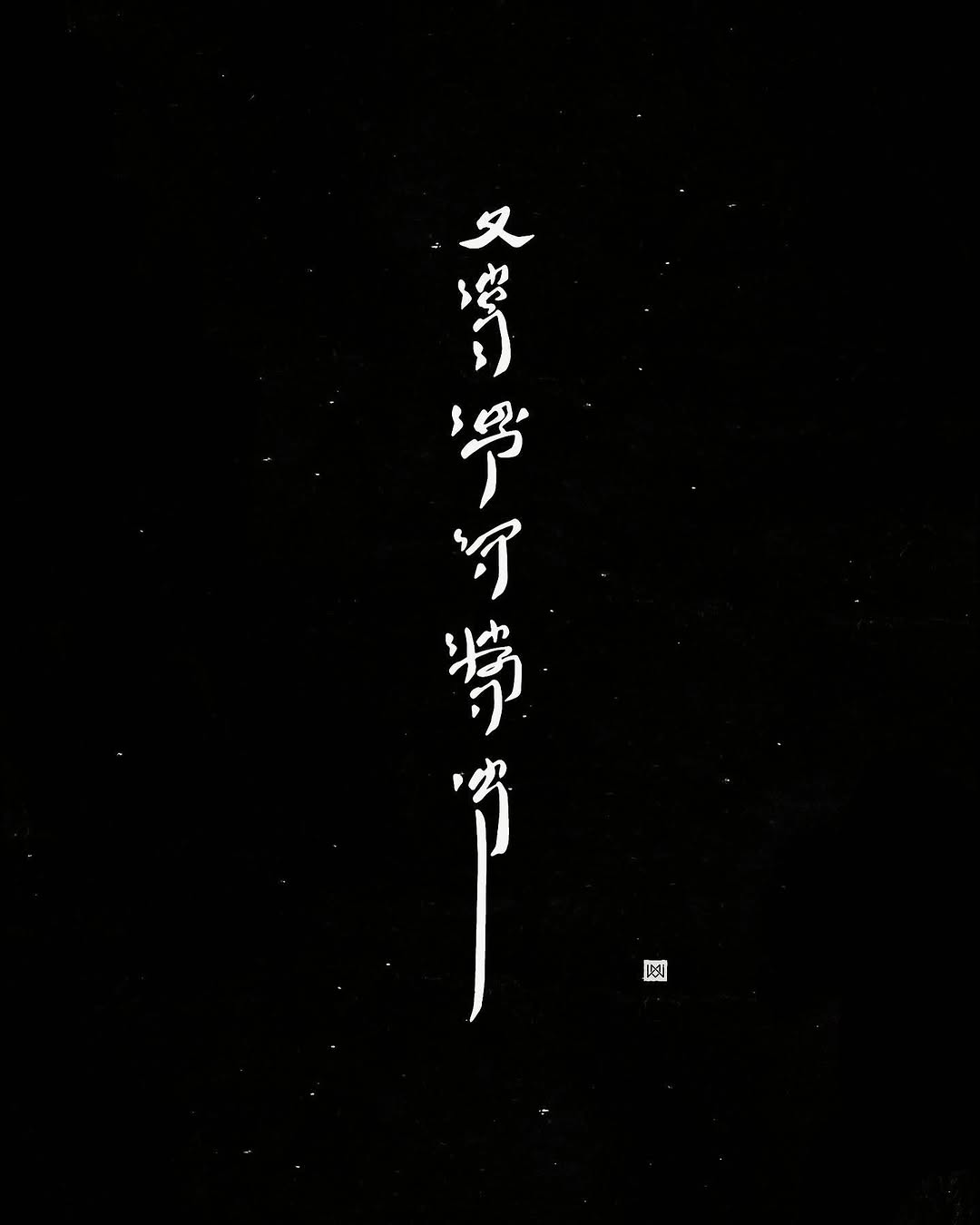
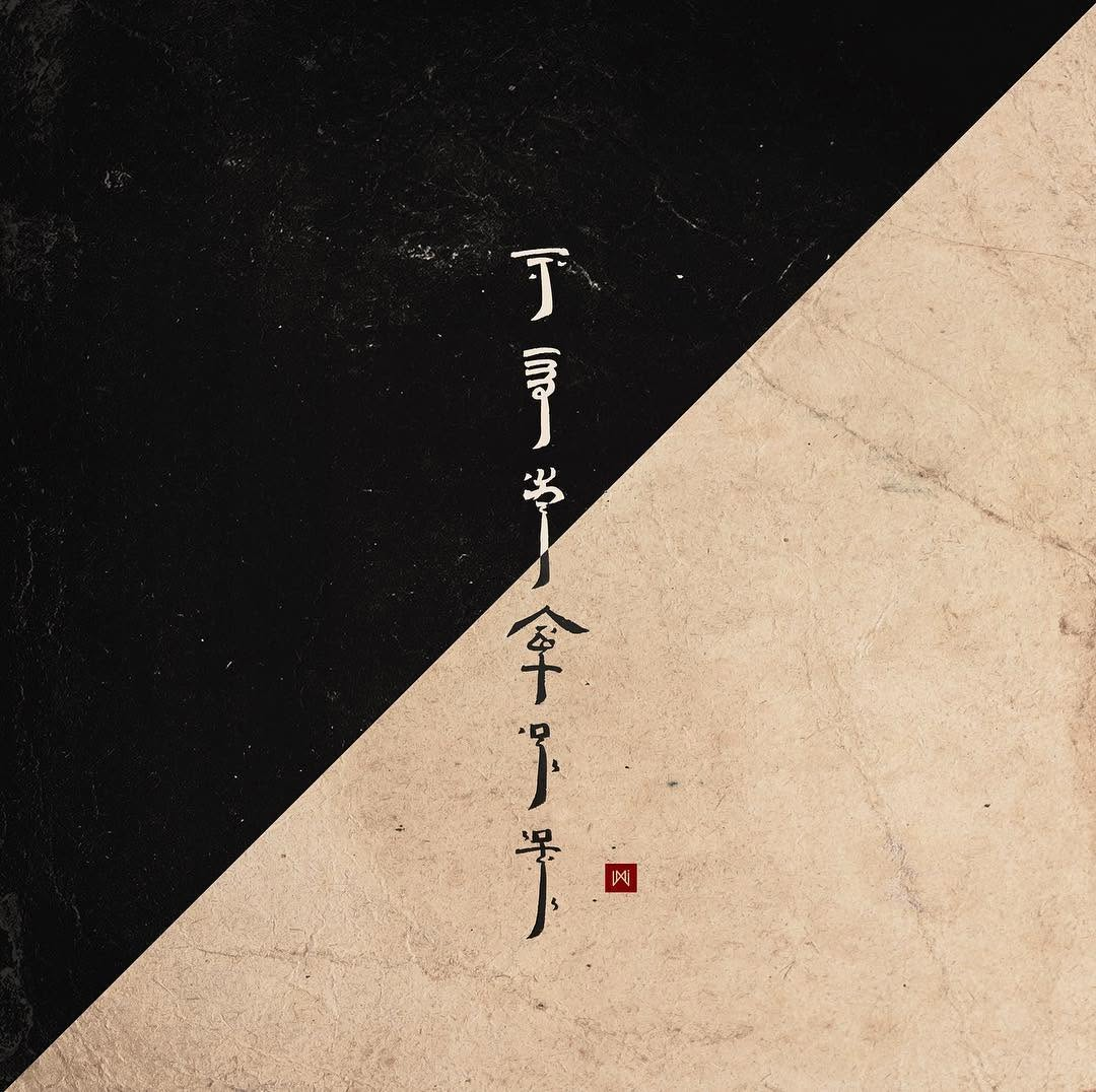
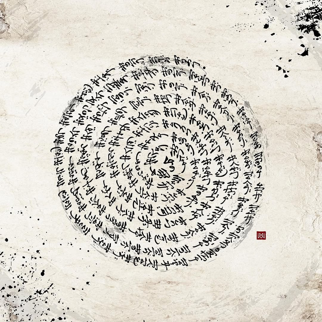
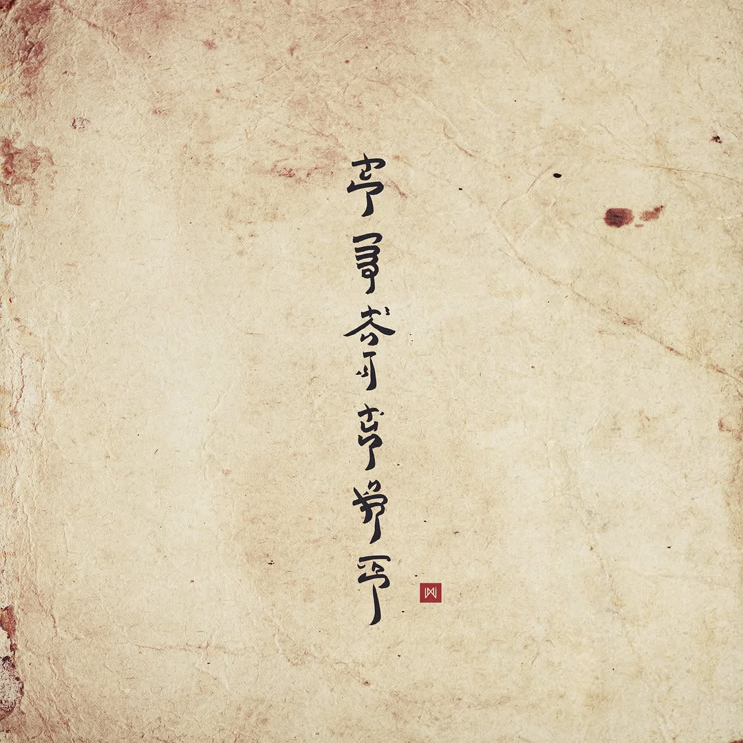
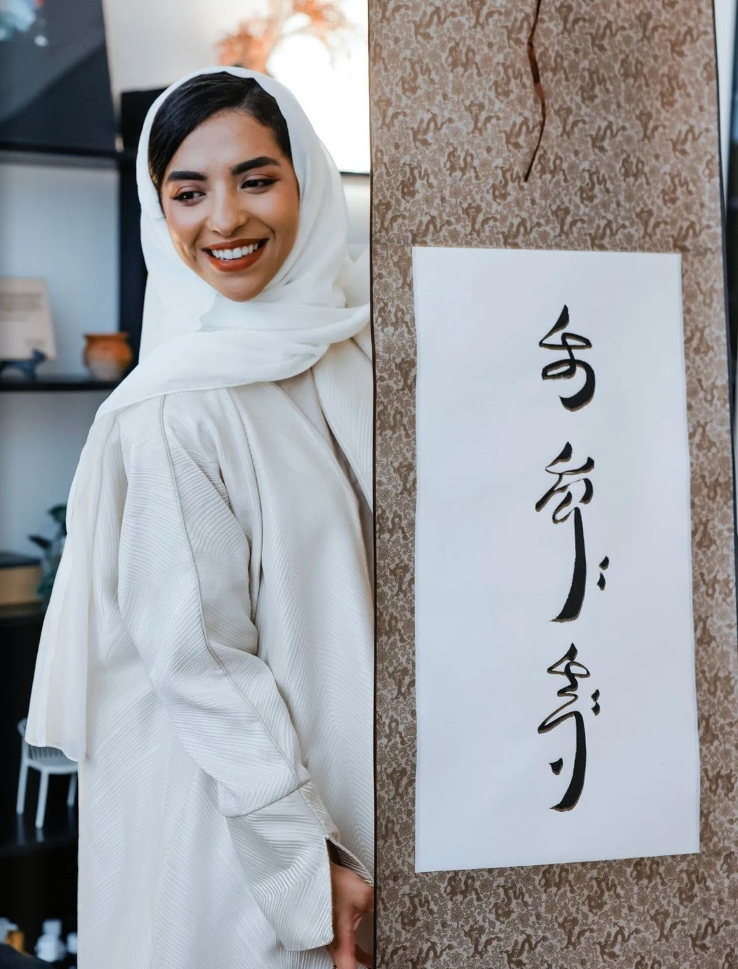
Noha Raheem’s work stands out for its fusion of Arabic calligraphy with Japanese Kanji-inspired visual form. Rather than approaching Arabic letters only through traditional horizontal composition, she allows them to rise vertically, gather into symbolic forms, and take on the quiet force of East Asian calligraphic aesthetics. Her art brings together Arabic meaning and Japanese-inspired rhythm, creating pieces that feel at once familiar and unexpected. The Arabic word remains rooted in its language and cultural weight, but its visual body is transformed.
Noha described this fusion as a way to show the “beauty and flexibility” of Arabic letters within a “complex yet innovative mix.” That flexibility is central to her identity as an artist. Her work does not treat tradition as something fixed. It treats it as something alive.
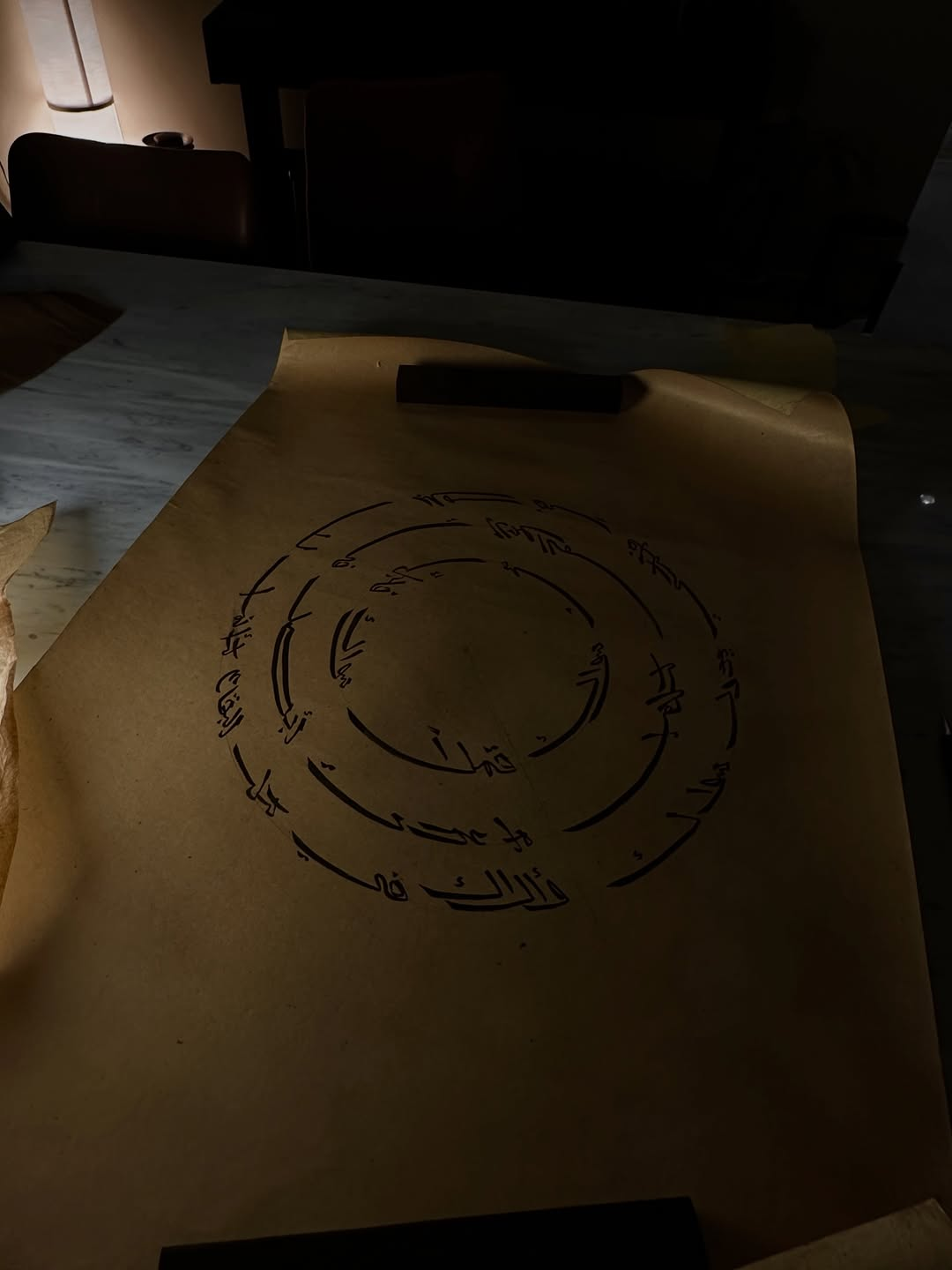
Before Kanji entered her visual world, Square Kufic shaped the way Noha saw Arabic letters. Square Kufic is geometric, structured, and architectural. It has a visual discipline that lends itself to pattern, symmetry, and design. For an artist with a background in interior design, its appeal is clear.
In Noha Raheem's work, this influence appears in the way letters are composed with balance and intention. Even when her pieces move into freestyle calligraphy, they often retain an underlying sense of order. Her letters feel built as much as written. They occupy space with the confidence of architecture, while still holding the intimacy of handwriting. This is where her design background becomes essential. She understands the page like a room. Each mark has weight. Each space has meaning.
Noha Raheem’s interest in Japanese writing began years before her work became known for fusion. She discovered the three famous Japanese scripts, Kanji, Katakana, and Hiragana, and was captivated by their form.
“The impressive vertical letters, the way they are formed and their meaningful symbols were like a secret code”.
That fascination eventually connected with her love of Arabic calligraphy, especially after discovering Hajji Noor Deen, whose work bridges Arabic and Chinese calligraphic traditions. Inspired by his approach, Noha began developing her own visual language, merging Arabic letters with the elegance and symbolic presence of Kanji-inspired composition. Her aim is not to disguise Arabic, but to reveal its adaptability.
“They can be shaped in any way, and still keep their form and meaning. Today I wrote my letters in the Kanji style. Later, I might do it in Urdu just to show the world how flexible and beautiful Arabic letters are.”
This idea gives her work its deeper purpose. Every piece becomes a quiet argument for the strength of Arabic script. It can travel across visual traditions and still remain itself.
Noha Raheem’s sources of inspiration are rooted in both culture and feeling. She draws from Arabic proverbs, poetry, the Qur’an, and emotion. Her chosen words are never simply decorative. They must carry meaning, memory, or emotional charge. This emotional center gives her work warmth. Even when the composition is visually complex, there is a human pulse behind it. She has also spoken about writing words people can relate to, including poetry, short verses, and universal messages. This makes her practice both personal and accessible. Her work does not only ask to be read. It asks to be felt.
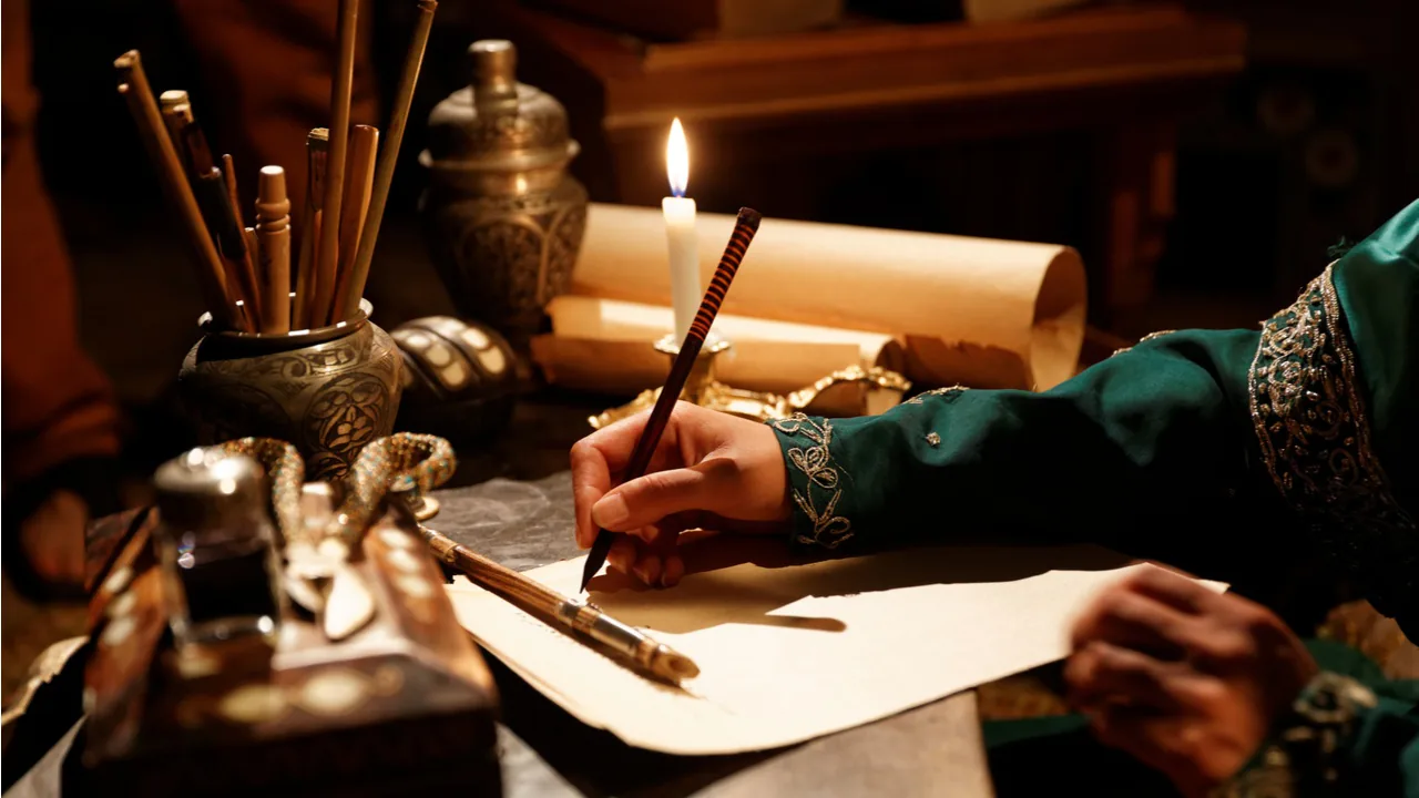
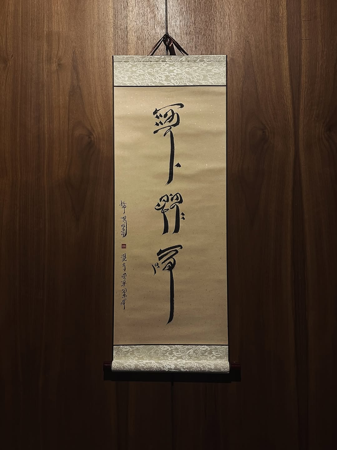
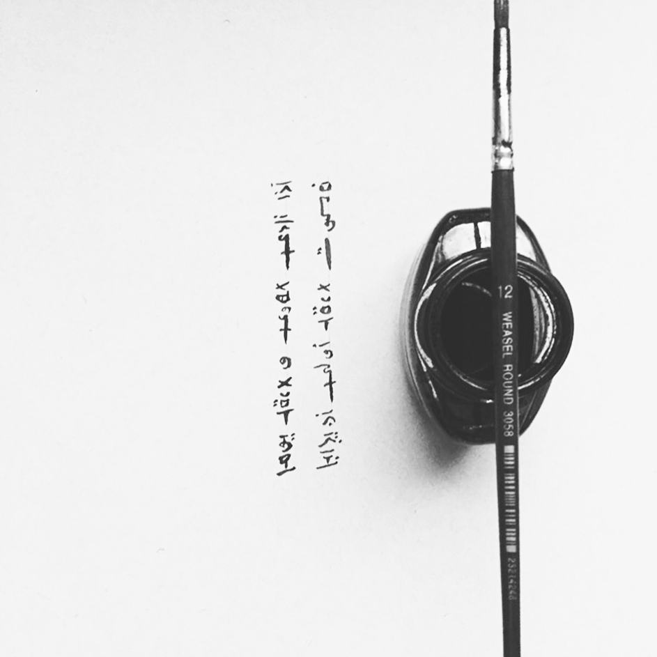
Noha Raheem’s practice is also defined by her attention to materials. To honor the traditions that inspire her, she uses Japanese and East Asian calligraphic tools and presentation methods, including Sumi ink, Japanese calligraphy brushes, Xuan rice paper, antique-style backgrounds, black script, and Kakejiku hanging scrolls.
These choices show that her fusion is not surface-level. She is not only borrowing a visual mood. She is engaging with the atmosphere, discipline, and material language of Japanese calligraphy. Her use of off-white backgrounds and black ink gives many of her works a quiet, timeless quality. They feel meditative, almost ceremonial. The result is a body of work that sits between graphic design, calligraphy, and cultural dialogue.
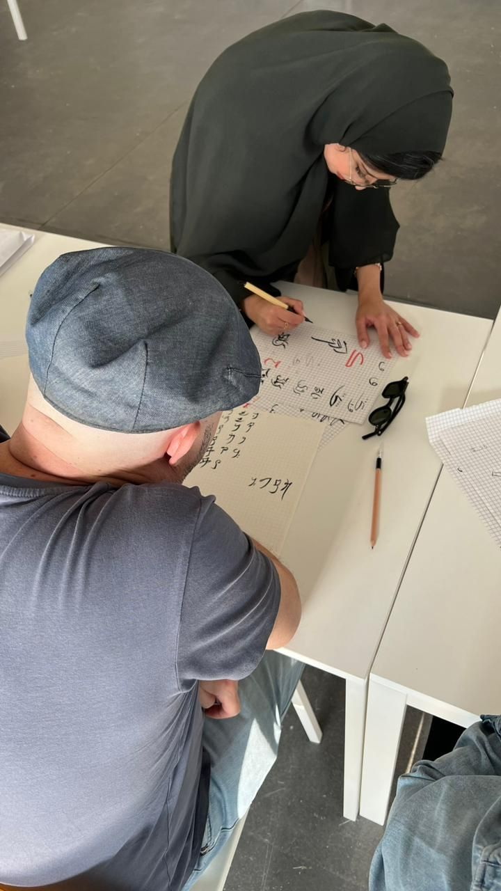
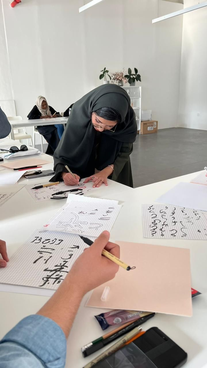
Noha Raheem has shared her knowledge and displayed her work in art cafés, galleries, and sushi restaurants in Saudi Arabia and Dubai. This range of spaces reflects the nature of her practice. Her work belongs in galleries, but it also speaks naturally to social and cultural spaces where people gather, eat, learn, and exchange ideas. In Riyadh, she also points to creative spaces such as AlMashtal, Sima Space, The Stage, and The Clear Hub as places for workshops, talks, social gatherings, and live cultural programming. Her recommendations reveal an artist connected to the energy of the city around her. Riyadh’s creative scene is not only a backdrop. It is part of the rhythm of her practice.
Raheem’s calligraphy has also entered global brand storytelling. For the Bvlgari Ramadan 2022 campaign, she contributed as a Saudi talent by creating a calligraphy piece designed to mirror the iconic V in the Bvlgari logo, connecting Arabic script with the visual identity of an international luxury house.
Noha Raheem’s work feels contemporary as it refuses to treat heritage as something fixed. Her calligraphy moves between Saudi identity, Arabic language, Japanese-inspired form, interior design, and global visual culture with unusual ease. What makes her practice compelling is the care behind the fusion. She's not simply placing one culture beside another. She is studying how forms behave, how materials carry meaning, and how a letter can shift shape without losing its soul.
From Square Kufic to Kanji-inspired calligraphy, from Najdi pattern work to international collaborations, her path suggests an artist still expanding her language. There is a sense that Noha Raheem is only beginning to show how far Arabic calligraphy can travel.
Discover more art stories reshaping Saudi culture at KSAArt.